

Featuring a new modern homepage, enhanced asset health and freshness monitoring, customizable dashboards, and real-time insights with cost monitoring.
Running a modern data platform often feels like operating in the dark. Pipelines break overnight, and you’re greeted in the morning with a wall of red failures and Slack pings. An executive asks for new metrics ahead of a meeting, and you’re left wondering whether the dataset they need is even up to date. A simple schema change in one system ripples downstream into broken dashboards, leaving your team scrambling to trace the lineage and patch things together. Instead of shipping new features or building reliable data products, teams are stuck in a cycle of chasing errors and putting out fires.
Observability isn’t just a nice-to-have anymore, it’s the foundation for running data platforms with confidence. Yet most tools make it hard to see the full picture, let alone act on it. That’s why we built the new Dagster+ UI: a command center designed to bring clarity, control, and confidence to every data team. Starting today, it’s available to all Dagster+ customers.
This update introduces a new modern homepage, enhanced asset health and freshness monitoring, customizable dashboards, and real-time insights with cost monitoring. This is our biggest step forward yet in giving data teams the visibility they need to run their platform with confidence.
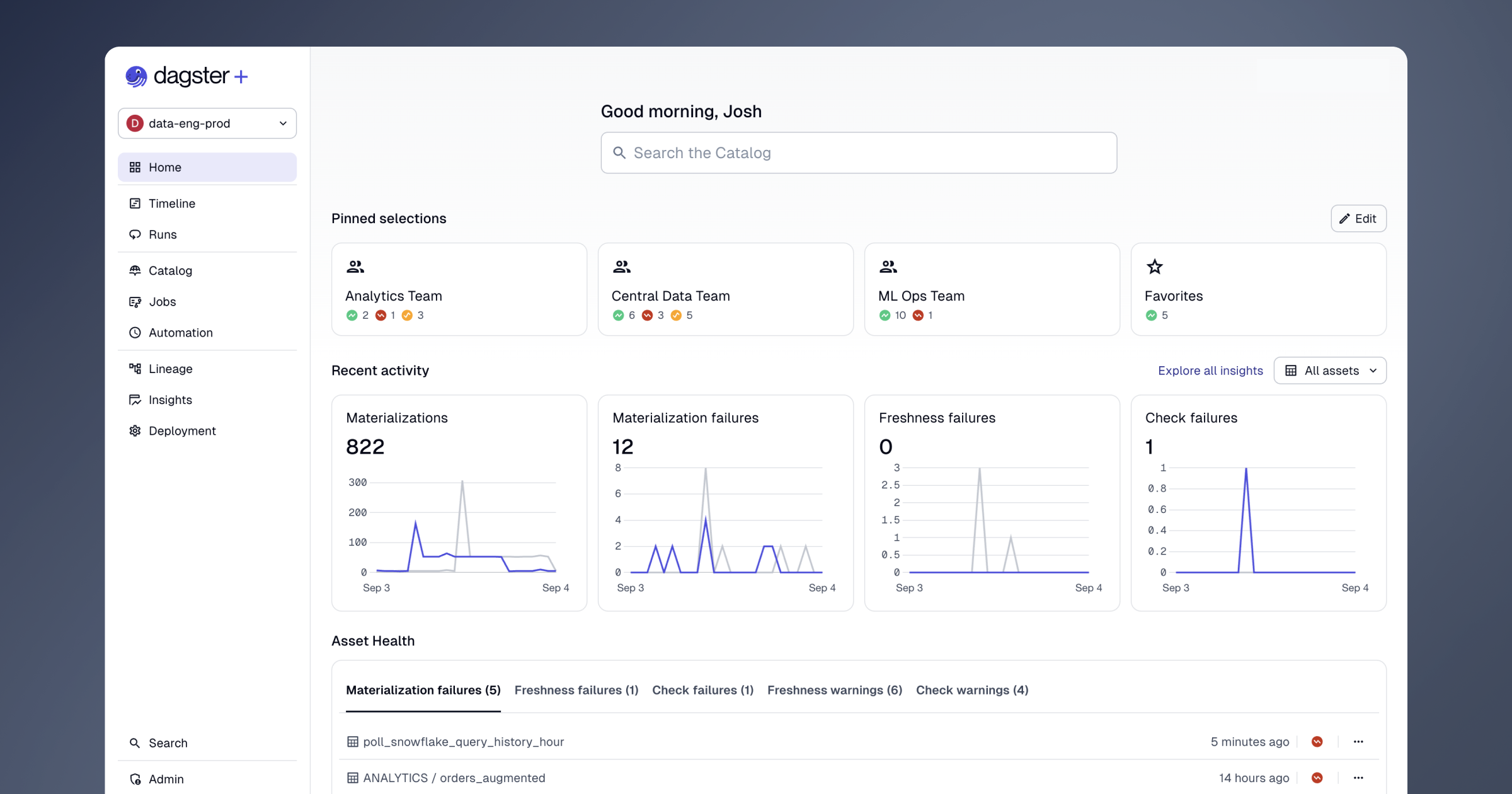
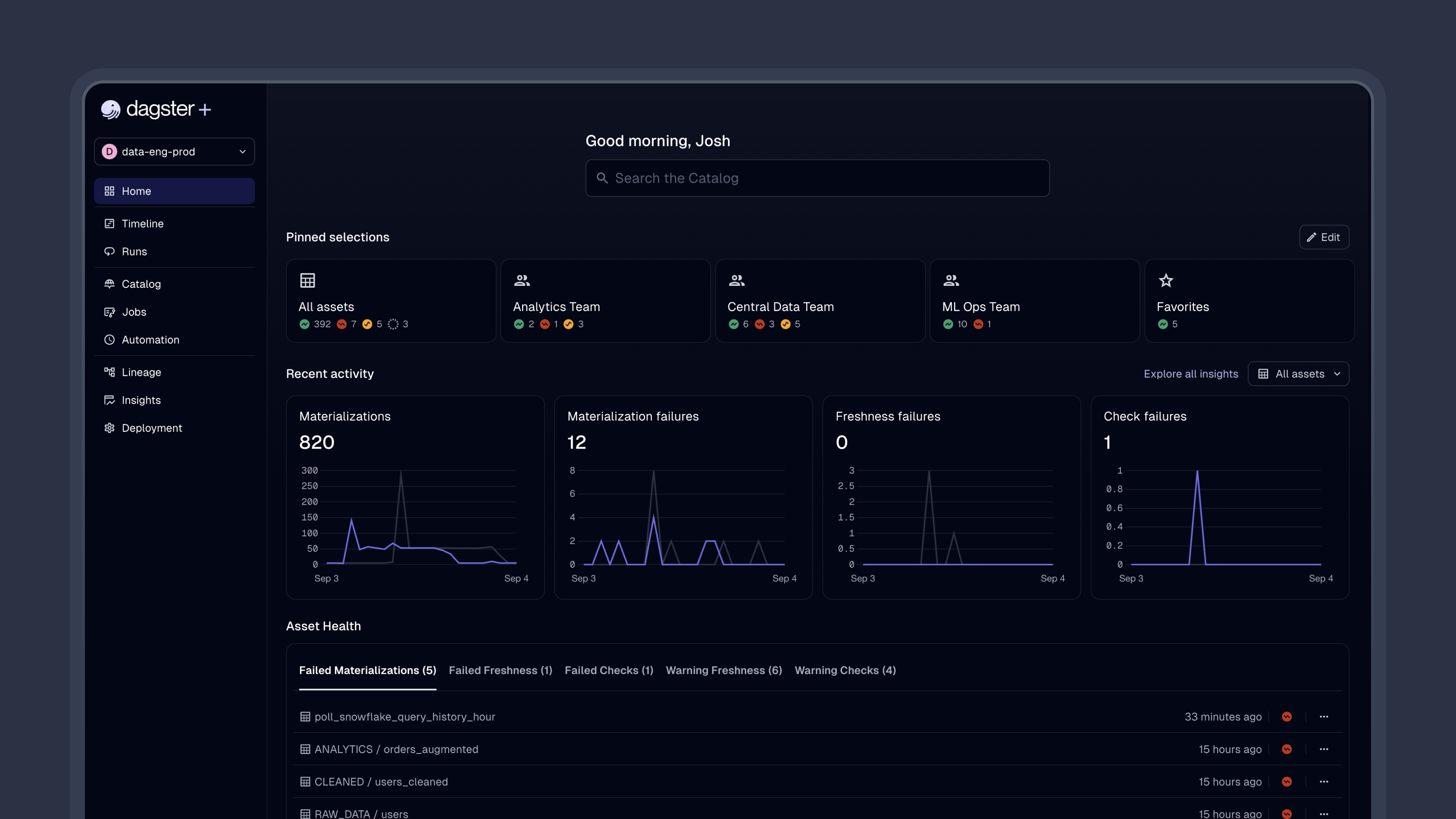
A New Homepage: Your Data Platform Command Center
The new homepage gives you a clear view of your platform so you can triage issues in real time. It brings together the most important signals in one place, helping teams quickly see what’s happening without needing to dive into individual jobs or dashboards.
Triage issues faster
Quickly identify failing assets and jobs, and spot issues with recent materializations, freshness, or data quality. Early customers tell us they often start their day here because it gives them an immediate read on what happened overnight, letting them move straight into resolving the most important issues.
"The new homepage is the first thing I check every morning. In just a few seconds, I know exactly what happened overnight and what needs my attention."
– Steven Ayers, Principal Data Engineer at RS Group
Make it your own
Pin the assets and jobs you care about most, and scope the homepage down to the exact slice of your platform that matters to you. For some users, this might be a single pipeline, while for others it might be an entire business unit.
Monitor Asset Health and Freshness at a Glance
Ensuring your data is healthy and up-to-date is now easier than ever. The new health and freshness tools are designed to give you confidence that the assets your teams depend on are always ready when they need them. Dagster+ takes the guesswork out of knowing whether your data is trustworthy by surfacing key signals and turning them into clear status indicators.
Stay on top of freshness
Define freshness policies for your assets so it’s obvious when something is out of date. Dagster continuously evaluates each asset’s materialization events, quality checks, and freshness policies to calculate its overall health, so you can see potential problems before they affect downstream work.
@asset(
    freshness_policy=FreshnessPolicy.cron(
        deadline_cron="0 10 * * *", # every day at 10:00 AM
        lower_bound_delta=timedelta(hours=1),
        timezone="America/Los_Angeles",
    )
)...
Act fast when health degrades
Every asset is tagged with a health indicator that doubles as a quick report card. Hover over it to get detailed diagnostics, and create alerts that trigger the moment an asset slips into a degraded or warning state. In the catalog, you can quickly filter and group by health status, making it simple to focus on what needs attention right now.
Organize Data Assets into Products with Dashboards
Saved selection dashboards make it easy to group assets into meaningful collections that reflect how your teams actually work. Whether you’re thinking in terms of a data product, a business unit, or a specific stage of a pipeline, the new dashboards help you keep everything that matters in one place. You can create a dashboard for any collection of assets using our expressive asset selection syntax.
Customize dashboards for your team
You can spin up dashboards for different teams or data products, share them across the organization, or keep them private. Each dashboard becomes a focused view of health, lineage, and real-time performance metrics, giving your team exactly what they need without distractions.
Simpler alerting
You can also create alert policies that target a saved selection, making it easier to configure and manage alert policies for specific teams or data products.
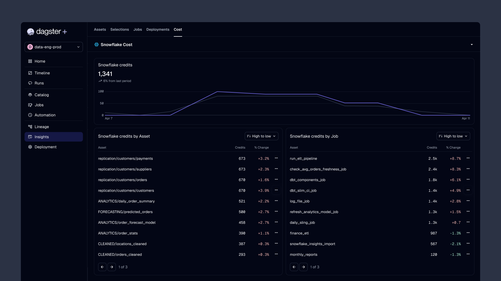
Real-Time Insights and KPI Monitoring
The new insights system makes it easier to keep an eye on the health of your data platform over time while also giving you the detail you need to take action. You now have one place to track key performance indicators, spot trends, and understand costs. It’s a great way to know what’s working, what’s not, and where things are shifting.
Track key metrics and trends
You can monitor new metrics like success rate, freshness pass rate, and time to resolution at both the asset and job level. The redesigned insights page makes it simple to see trends and week-over-week changes, helping you spot outliers before they become real problems. Later this year, you’ll be able to set up alert policies that trigger anytime metrics cross a certain threshold – this is great for realtime cost or performance monitoring.
Compare performance across teams
The new Insights comparison tools let you line up to five selections or deployments side by side. This makes it easy to see how different teams, product areas, or lifecycle stages are performing against each other, and where improvement efforts will make the biggest difference.
Understand and control costs
Cost Insights bring unified visibility for Snowflake and BigQuery spend right into Dagster+. With a clear picture of where your budget is being spent, you can quickly identify high-cost assets or inefficient jobs and take action to rein in spend. The new Cost Insights tab will be available to all Dagster+ Pro customers starting next week.
Fine-Tune Asset Lineage with Facets
Facets give you more control over how you see lineage. You can turn pieces of metadata on or off depending on what you need in the moment. Sometimes you just want a clean graph with asset names, other times you want rich context with owners, automation conditions, latest materializations, and health status.
Each user can decide which facets are right for them, making lineage flexible enough for both quick scanning and deep debugging.
Accessing the New UI
The new UI is available today for all Dagster+ customers. Just accept the invite in the app to get started, and know that you can opt out at any time during the early access period. Share your thoughts directly in the app using the integrated feedback button.
👉 Not a Dagster+ customer yet? Sign up for a free trial or request a demo today.
What’s next
Throughout the early access period, we’ll be adding additional functionality like:
- Custom time range selections in Insights
- Realtime Insights metric alerts so you can trigger notification whenever a metric threshold is met.
The new Dagster+ UI is built to help you move faster, stay in control, and make better decisions about your data platform. This update is just one part of our larger vision to make Dagster+ a complete data-ops platform. We're excited for you to try it out.


.jpg)
.png)
.png)