Data exploration definition:
Data Exploration, also called exploratory data analysis (EDA) refers to manual steps you can take to understand the data, identify patterns, and gain insights. This might involve examining data distributions, summary statistics, correlations, and visualizations.
Example of data exploration in Python
Let's assume that you want to work with data related to the sales of a supermarket. We will use the Pandas, Matplotlib and Seaborn libraries to perform the exploratory data analysis.
Your supermarket orders data is saved in a file called supermarket_sales.csv structured as follows:
| ID | City      | Customer\_type | Gender | Product\_line          | Unit\_price | Quantity | Tax (5%) |  Total | Date      | Time  | Payment     |   COGS | Gross\_margin\_percentage | Rating |
| -- | --------- | -------------- | ------ | ---------------------- | ----------- | -------- | -------- | ------ | --------- | ----- | ----------- | ------ | ------------------------- | ------ |
| 1  | Yangon    | Member         | Female | Health and beauty      |       74.69 |        7 |    26.14 | 548.97 | 1/5/2019  | 13:08 | Ewallet     | 522.83 |               4.761904762 |    9.1 |
| 2  | Naypyitaw | Normal         | Male   | Electronic accessories |       15.28 |        5 |     3.82 |  80.22 | 3/8/2019  | 10:29 | Cash        |  76.40 |               4.761904762 |    9.6 |
| 3  | Yangon    | Normal         | Female | Home and lifestyle     |       46.33 |        7 |    16.22 | 340.52 | 2/3/2019  | 13:23 | Credit card | 324.31 |               4.761904762 |    7.4 |
| 4  | Yangon    | Member         | Male   | Health and beauty      |       58.22 |        8 |    23.29 | 489.05 | 2/27/2019 | 20:33 | Ewallet     | 465.76 |               4.761904762 |    8.4 |
| 5 | Yangon | Normal | Male | Sports and travel | 86.31 | 7 | 30.21 | 634.38 | 2/8/2019 | 10:37 | Ewallet | 604.17 | 4.761904762 | 5.3 |To perform some initial data exploration, we will do the following:
- Load the required libraries.
- Load the data from a CSV file.
- Perform basic exploration of the data including viewing the first few rows, printing summary statistics, and checking the shape of the data.
- Check for missing values.
- Print the unique values in each of the categorical columns.
We will then use Seaborn to plot some graphs:
- Visualize the data distribution of numerical columns using histograms.
- Visualize the correlation matrix to understand the relationships between numerical variables.
- Generate a pair plot of the first five columns to visualize relationships and distribution of each column.
- Finally, create a box plot to see the relationship between a categorical variable and a numerical variable.
Please note that you need to have the necessary Python libraries installed in your Python environment to run this code.
# Import required libraries
import pandas as pd
import numpy as np
import matplotlib.pyplot as plt
import seaborn as sns

# Load data from CSV file
df = pd.read_csv('supermarket_sales.csv')

# Print first 5 rows of the dataframe
print(df.head())

# Print the summary statistics
print(df.describe())

# Print the info about dataframe
print(df.info())

# Print the shape of the dataframe
print("The dataset contains ", df.shape[0], "rows and ", df.shape[1], "columns")

# Checking for missing values
print(df.isnull().sum())

# Check the unique values in categorical columns
for col in df.select_dtypes(include=['object']).columns:
    print("Unique values in column: ", col)
    print(df[col].unique())

# Histogram for the numerical columns
df.hist(bins=50, figsize=(20,15))
plt.show()

# Correlation matrix
corr_matrix = df.corr()
sns.heatmap(corr_matrix, annot=True)
plt.show()

# Pair plot for the first five columns
sns.pairplot(df.iloc[:, :5])
plt.show()

# Box plot for a categorical column against a numerical column
sns.boxplot(x='City', y='Total', data=df)
plt.show()Let's look at the output
Running the code above will generate a number of outputs for us to look at. Let's walk through them in order:
# Print first 5 rows of the dataframe
print(df.head())This first command sImply gives us the first five rows from our csv file, now turned into a Pandas Dataframe:
| ID | City      | Customer\_type | Gender | Product\_line          | Unit\_price | Quantity | Tax\_5% |  Total | Date      | Time  |     Payment |   COGS | Gross\_margin\_percentage | Rating |
| -- | --------- | -------------- | ------ | ---------------------- | ----------- | -------- | ------- | ------ | --------- | ----- | ----------- | ------ | ------------------------- | ------ |
| 1  | Yangon    | Member         | Female | Health and beauty      |       74.69 |        7 |   26.14 | 548.97 | 1/5/2019  | 13:08 |     Ewallet | 522.83 |                  4.761905 |    9.1 |
| 2  | Naypyitaw | Normal         | Male   | Electronic accessories |       15.28 |        5 |    3.82 |  80.22 | 3/8/2019  | 10:29 |        Cash |  76.40 |                  4.761905 |    9.6 |
| 3  | Yangon    | Normal         | Female | Home and lifestyle     |       46.33 |        7 |   16.22 | 340.52 | 2/3/2019  | 13:23 | Credit card | 324.31 |                  4.761905 |    7.4 |
| 4  | Yangon    | Member         | Male   | Health and beauty      |       58.22 |        8 |   23.29 | 489.05 | 2/27/2019 | 20:33 |     Ewallet | 465.76 |                  4.761905 |    8.4 |
| 5  | Yangon    | Normal         | Male   | Sports and travel      |       86.31 |        7 |   30.21 | 634.38 | 2/8/2019  | 10:37 |     Ewallet | 604.17 |                  4.761905 |    5.3 |
Next, we look at the summary statistics...
# Print the summary statistics
print(df.describe())...which in our case gives us:
| Statistic    | ID   | Unit\_price | Quantity | Tax\_5% | Total  | COGS   | Gross\_margin\_percentage | Rating |
| ------------ | ---- | ----------- | -------- | ------- | ------ | ------ | ------------------------- | ------ |
| count        | 5    | 5.00        | 5        | 5.00    | 5.00   | 5.00   | 5.00                      | 5.00   |
| mean         | 3    | 56.17       | 6.80     | 19.94   | 418.63 | 398.69 | 4.76                      | 7.96   |
| std          | 1.58 | 27.50       | 1.10     | 10.35   | 217.44 | 207.08 | 0.00                      | 1.70   |
| min          | 1    | 15.28       | 5        | 3.82    | 80.22  | 76.40  | 4.76                      | 5.30   |
| 25%          | 2    | 46.33       | 7        | 16.22   | 340.52 | 324.31 | 4.76                      | 7.40   |
| 50% (median) | 3    | 58.22       | 7        | 23.29   | 489.05 | 465.76 | 4.76                      | 8.40   |
| 75%          | 4    | 74.69       | 7        | 26.14   | 548.97 | 522.83 | 4.76                      | 9.10   |
| max | 5 | 86.31 | 8 | 30.21 | 634.38 | 604.17 | 4.76 | 9.60 |Then we return the dataframe details and shape...
# Print the info about dataframe
print(df.info())

# Print the shape of the dataframe
print("The dataset contains ", df.shape[0], "rows and ", df.shape[1], "columns")... which yields:
<class 'pandas.core.frame.DataFrame'>
RangeIndex: 5 entries, 0 to 4
Data columns (total 15 columns):
 #   Column                    Non-Null Count  Dtype
---  ------                    --------------  -----
 0   ID                        5 non-null      int64
 1   City                      5 non-null      object
 2   Customer_type             5 non-null      object
 3   Gender                    5 non-null      object
 4   Product_line              5 non-null      object
 5   Unit_price                5 non-null      float64
 6   Quantity                  5 non-null      int64
 7   Tax_5%                    5 non-null      float64
 8   Total                     5 non-null      float64
 9   Date                      5 non-null      object
 10  Time                      5 non-null      object
 11  Payment                   5 non-null      object
 12  COGS                      5 non-null      float64
 13  Gross_margin_percentage   5 non-null      float64
 14  Rating                    5 non-null      float64

dtypes: float64(6), int64(2), object(7)
memory usage: 728.0+ bytes

None
The dataset contains 5 rows and 15 columnsWe check for missing values with
# Checking for missing values
print(df.isnull().sum())... which confirms that none of the columns have missing values:
ID                          0
 City                       0
 Customer_type              0
 Gender                     0
 Product_line               0
 Unit_price                 0
 Quantity                   0
 Tax_5%                     0
 Total                      0
 Date                       0
 Time                       0
 Payment                    0
 COGS                       0
 Gross_margin_percentage    0
 Rating                     0
dtype: int64Next we check for unique values:
# Check the unique values in categorical columns
for col in df.select_dtypes(include=['object']).columns:
    print("Unique values in column: ", col)
print(df[col].unique())which gives us a convenient breakdown of the unique values in the dataset:
Unique values in column:  City
['Yangon' 'Naypyitaw']
Unique values in column:  Customer_type
['Member' 'Normal']
Unique values in column:  Gender
['Female' 'Male']
Unique values in column:  Product_line
['Health and beauty' 'Electronic accessories' 'Home and lifestyle'
 'Sports and travel']
Unique values in column:  Date
['1/5/2019' '3/8/2019' '2/3/2019' '2/27/2019' '2/8/2019']
Unique values in column:  Time
['13:08' '10:29' '13:23' '20:33' '10:37']
Unique values in column:  Payment
['Ewallet' 'Cash' 'Credit card']
Let's do some visualization
So far we have returned insights into the shape and statistical profile of our dataset. Next let's use Seaborn to create some histograms of our data.
About Seaborn
Seaborn is a Python data visualization library based on Matplotlib. It provides a high-level interface for creating informative and attractive statistical graphics.
Seaborn is great for exploratory data analysis (EDA) because it makes it easy to visualize complex patterns in data. It's especially good for visualizing statistical models, such as linear regression. However, Seaborn is a layer on top of Matplotlib, so it can be a bit more challenging to use for custom visualizations. For such cases, Matplotlib might be a better option.
Here are some of the features that Seaborn offers:
- Built-in themes: Seaborn comes with a number of customized themes and a high-level interface for controlling the look of Matplotlib figures.
- Visualizing univariate and bivariate distributions: Seaborn allows you to visualize distributions of one or two variables including histograms, density plots, and scatter plots.
- Aggregated and conditional plots: Seaborn can create plots that show the relationship between variables with aggregation and conditioning (like boxplots, violin plots, and pair plots).
- Heatmaps: Seaborn is great for creating heatmaps, which can be used for anything from correlation matrices to confusion matrices.
- Integration with Pandas: Seaborn works well with Pandas dataframes and arrays that contain datasets. It also integrates closely with pandas data structures.
- Multi-plot grids: Seaborn makes it easy to setup multi-plot grids for laying out complex visualizations.
The graphical output
Granted, our dataset is small (just five items) and simple so our data visualization might be underwhelming, but this is a basic demonstration and you can build from here. Feel free to generate a more complicated dataset to make these examples more interesting.
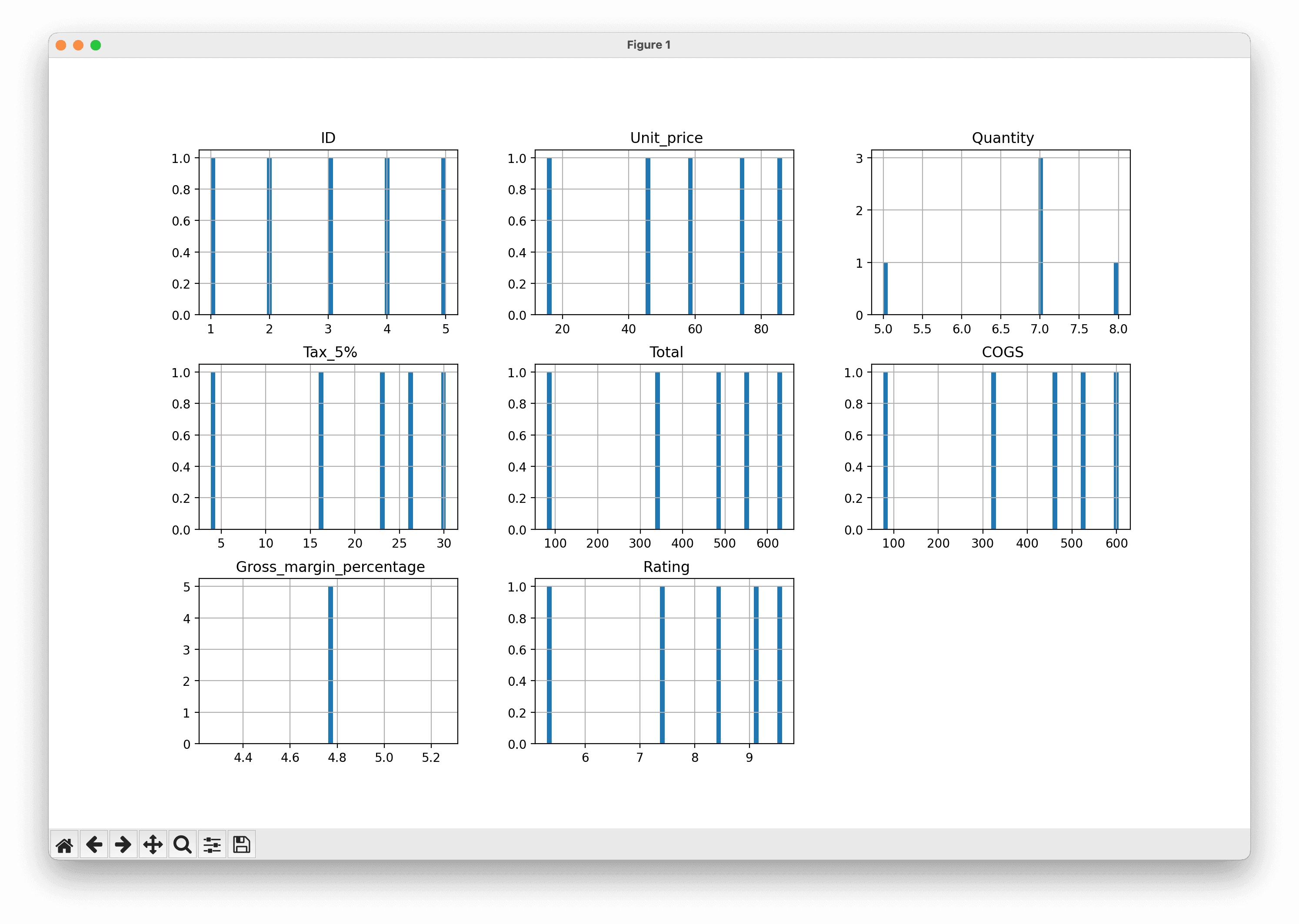
Visualize the data distribution of numerical columns using histograms.
Out first visualization only uses Matplotlib, and will take the numerical columns from our dataset and return a basic histogram for each:
# Histogram for the numerical columns
df.hist(bins=50, figsize=(20,15))
plt.show()Which gives us this:
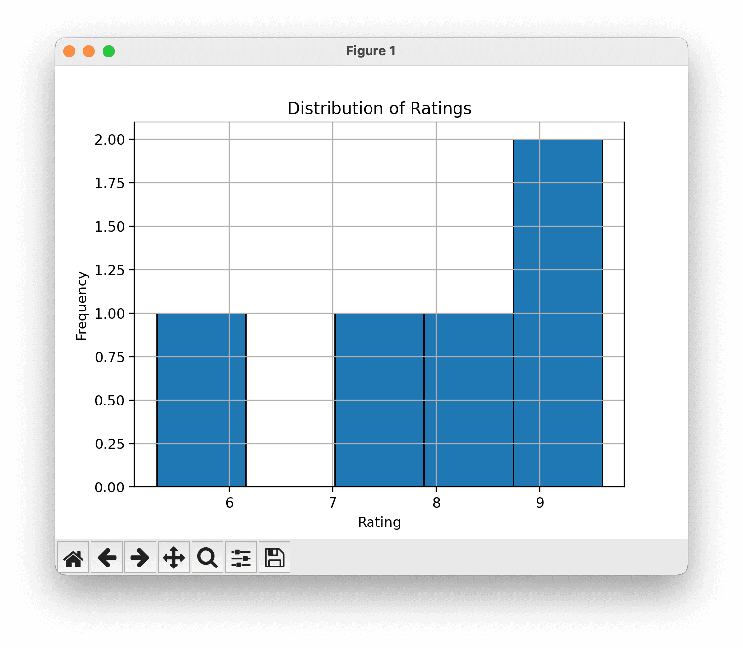
If you like, you can replace those two lines of code with something more interesting which will plot just one of the columns, say Ratings.
# Create a histogram of the 'Rating' column
df['Rating'].hist(bins=5, edgecolor='black')

plt.title('Distribution of Ratings')
plt.xlabel('Rating')
plt.ylabel('Frequency')

plt.show()
Our vizualisation now makes more sense:
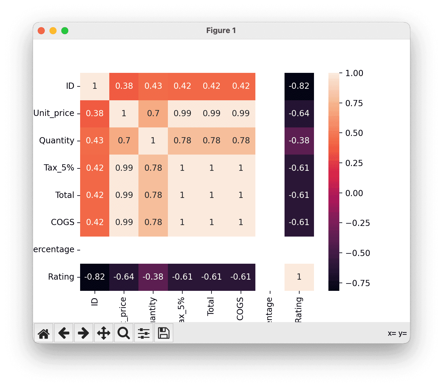
Visualize the correlation matrix to understand the relationships between numerical variables.
Here we use Seaborn with sns.heatmap:
# Correlation matrix
corr_matrix = df.corr()
sns.heatmap(corr_matrix, annot=True)
plt.show()
Generate a pair plot of the first five columns to visualize relationships and distribution of each column.
# Pair plot for the first five columns
sns.pairplot(df.iloc[:, :5])
plt.show()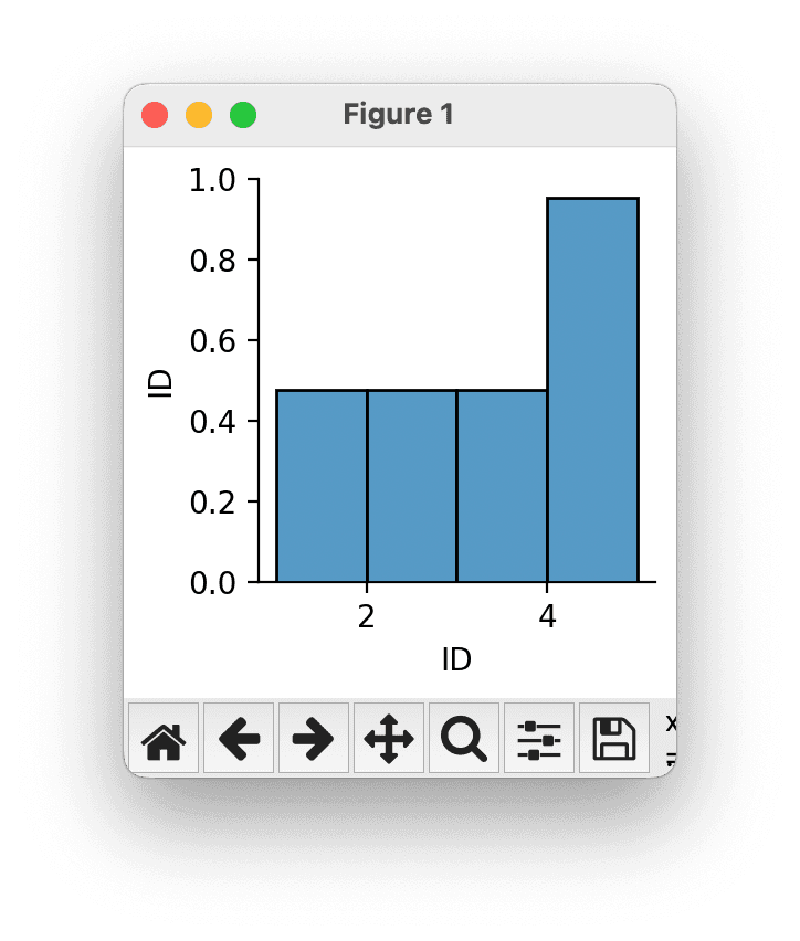
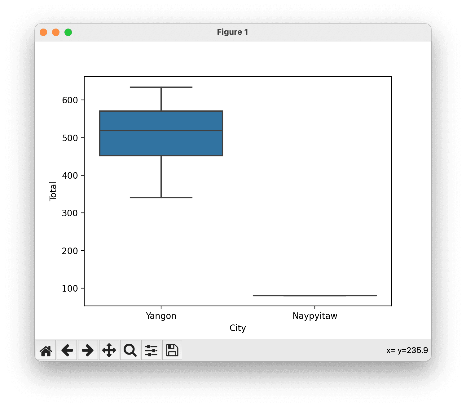
Create a box plot to see the relationship between a categorical variable (City) and a numerical variable (Total).
# Box plot for a categorical column against a numerical column
sns.boxplot(x='City', y='Total', data=df)
plt.show()Again, the plot is very simple with just five rows of data, but you can explore from here.